Take a second to ask yourself if accidentally shutting the door on potential customers is good for business or generally respectful to folks. Well, the thing is, that’s exactly what might be happening on your website, especially if you're not baking accessibility testing and optimization into your web development workflow. But don't stress, because we're here to be your accessibility guide!
Here's the deal. A lot of times, when it comes to websites, accessibility seems to be an afterthought. Not the best approach, because it means that people with disabilities might find your website a bit like a maze. And that's not cool at all — let's save the labyrinths for poofy-hair David Bowie and his merry-making, nightmare-inducing muppet goblin friends (DB's tight-tights did look hella comfy tho, not gonna lie).
Well, you've got a couple of options on the table. First up, there's those snazzy apps and plugins for platforms like WordPress and Shopify that have great marketing and promise turnkey solutions (looking at you accessiBe). Sounds like a friggin’ breeze, right? Well, not so fast. These tools can handle about 20% of the accessibility work, mainly focusing on the looks of things. But here's the twist: the other 80% is where the real magic happens. We're talking about nailing down screen-readers and keyboard navigation – that's where the real accessibility gold lies, and that's where we, Victory Creative, roll up our sleeves and dig in.
The other option is pure manual step-by-step review and optimization. We’ve earned knowledge and experience by working with national corporations and household name brands and have found that you cannot avoid the manual approach and achieve an adequate result. Don’t make the mistake that all you need to do is install an app or plugin and walk away! Be prepared to learn about accessibility guidelines and WCAG 2.1 jargon like "Level AA" and "Priority 2" – and yes, it is important stuff. But let's be honest, diving into all that info can feel like exploring the deep sea. And it's not just about reading – it's testing, testing, and more testing. Sounds like a full-time gig, right? So if coding isn't exactly your jam, you might already be thinking about bringing in us.
Let's loop back to why this is important. We’ve mentioned that around one in five people have some form of disability worldwide. That's a pretty huge chunk of potential customers, wouldn't you say? If your website isn't accessible, you could be missing out on a lot. But here's the kicker – it's not just about business, it's about being a good digital neighbor, throwing open the door for everyone.
But wait, there's more. Just like when a brick-and-mortar storefront isn’t physically accessible, if your site isn't up to scratch in the accessibility department, you could be in for some legal hurdles. Yep, you heard that right. The Department of Justice says websites are like public spaces, and if they're not accessible, you could be in for a rollercoaster ride. Lawsuits have spiked a whopping 300%, and guess who's in the spotlight? Yep, ecommerce sites are right there. That's a real wake-up call!
We've got some top-notch talent, experience and coding magic. We scan your site, hunt down the issues, and systematically fix 'em up. Suddenly, your site is a welcoming hub for everyone. Oh, and here's the cherry on top – we save you time and money too. Even if you're a small business, you can totally make accessibility a reality without breaking the bank.
So, let's come together and make the internet a friendlier place, one website at a time. Get in touch with Victory Creative, and let us sprinkle our accessibility magic on your site. Your visitors – and your peace of mind – will be forever grateful!
]]>But I quickly realized I was thinking as a consumer and small business owner and not as a behemoth corporate enterprise and my eyes began to widened. Considering we develop for Shopify, suggest our clients use it and host our Victory Creative website on it—where you're reading this right now—I hope you can cut me some slack!
But while Adobe may wish to take marketshare away from Shopify, there is a another ecommerce business that Adobe's eyeing more directly: Demandware. In fact, Adobe's been eying Demandware for years and as recently as July of 2016 tried to acquire Demandware, only to lose out in a bidding war to Salesforce (CRM) who spent over $1B more than Adobe is spending on Magento.
Salesforce, also owner of Radius6 (RIP), Heroku and recently acquired services connector MuleSoft, is going to be hard pressed to compete with Adobe on the enterprise level as it continuously and effectively is expanding its portfolio of creative, marketing and ecommerce products.
But unlike Demandware, which skews corporate by running a less accessible pay-to-play style platform with a steep barrier to entry (I’m talking steep, like starting at around $200k for a license steep), Adobe has a unique, time-tested ability to toe the line between corporate and consumer user bases. Which brings me back to the super reasonably accessible Shopify platform.
In comparison to Magento, the most powerful attributes that Shopify has going for it are:
Keep a close eye on how Adobe remaps the direction for the future of Magento:
My bet is that Adobe will chip away at Demandware’s corporate foothold while bringing some of Shopify’s best consumer and designer/developer friendly attributes to Magento. I see a huge advantage to Adobe as the familiar, beloved name brand to a wide range of creators, from students designing their first graphic to Ecommerce Directors at behemoth corporate enterprises (who have long histories of signing SLAs with Adobe, by the way).
- - - - - - - - - -
Tell us what you think. We would love to hear your reaction to this acquisition of Magento by Adobe or other digital marketing and ecommerce news and ideas.
-Paul Larrow
Founder, Director of Victory Creative Inc
]]>
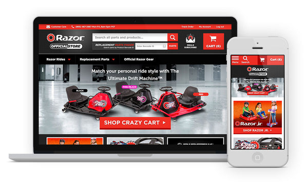
One challenge we're often faced with is working with photography and video assets that do not fit the layout of a landing page template or website. And while we find ways to make these images work, we regularly find our clients coming to us for advice on how to best direct photographers and videographers for digital success. After much experience collaborating with photographers and brands, we're excited to share our list of favorite tips and tricks when shooting for the web.
When you're a designer, you've received every type of creative asset you could imagine. You've clipped paths on so many product photos that you're about to change the title on your biz card to "Landscaper". Your creative director calls you "Dr Pixel-Perfect" because of your shaman-like mastery of Photoshop's "healing" brush. Your client sent you images so low-res that 1997 paged your beeper to ask for them back. Fever-dreams wake you up in the middle of the night because you think the FBI is knocking down your door to haul you off for the stolen photography your client demanded you use on the website. And then there's just the general boring, improperly formatted, cheap, horrible, no-good, very bad photography.
And on the rare occasion, if you've stockpiled karma and mercury's not in retrograde, you find yourself working with perfectly professional, properly formarted, gorgeous, hi-res photography. Feeling inspired, you hunt down the photographer, cook them a wholesome organically-sourced dinner accompanied by the most antioxidant-rich red wine and mouth kiss them until dawn breaks the next morning.
For example, consider these two gorgeous photos taken by one of our favorite photographers, Katie Gardner, of Katie Gardner Photography:
Both photos are beautifully lit and composed, have ample white space to add in copy and backgrounds that can easily be extended horizontally into landscape aspect ratios to fit most responsive web design applications.
Read on to learn more specifics about how to guide a photography shoot to create the most versatile and useable creative assets. We have also made this How-To Guide available for download.
For images, the aspect ratio is essential. This is the proportional relationship between the height and width of an image. These ratios between height and width are fixed and the only way we can change them is if we crop the image. In short, the challenge we often face with traditional photo aspect ratios is - they aren’t always perfect for web design.
Landing page hero shots often require breathing room around the central focal point and will frequently be wider and shorter than the traditional widescreen 16:9 aspect ratio. This is why we recommend shooting options with a 21:9 aspect ratio in addition to 16:9.
When setting the stage to capture that perfect shot, it can be easy to forget where your copy is going to fit. You want it to be legible and readable to your customer while not taking away from the focus of your beautifully crafted image. When the copy is difficult to decipher, your customer is forced to either strain their eyes or skip over the content.
Your photos and video shots should include space for advertising headlines, short descriptions and your call to actions. Your images will work best if you decide ahead of time what you want to communicate in the space you are creating.
When composing a hero shot, keep eye scan patterns in mind, and particularly the Z-pattern vs. the F-pattern.
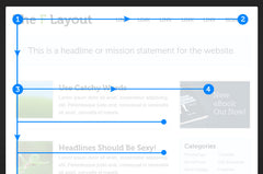
F-Pattern sites are for generally text-heavy pages. It makes it easy for the visitor to scan down the page until the reader finds something she likes, then scan across. The end result is something that looks like the letter F or E, hence the name.
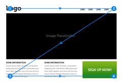
However, visitors reading landing pages centered on photography or video follow a modified Z pattern. The Z-Pattern addresses the core website requirements such as hierarchy, branding, and calls to action. Suggestive directional cues will help convince your visitor to complete the action you want them to complete. For example, if a “Buy Now” or “Learn More” button is in the bottom right of the composition, suggestive direction cues can help push your visitor’s attention to this call to action.
So while you’re staging your perfect shot, make sure you're considering suggestive directional cues, such as the direction of your model’s glance, the motion of the shot, or a single focal point. Do they flow with the pattern of the ‘Z’? Yes? Then perfect!
Now it's your turn. Take a look at these two amazing photos, both by Ian Boyle, the Creative Director and Photographer behind Riding the Lane. Which would work best overall when designing a landing page?
Even though both images are stunning, from a design perspective, it's clear to see Photo 2 is the best choice to start designing our hypothetical landing page.
And there you have it, our secrets for setting yourselves up for quality landing page photography and video! Download our guide to keep in your production folder or share with your creative team. Note, this guide is not intended to act as a constraint for content and editing decisions but instead allow for video/photography production teams to create assets that will assist your web development efforts.
With these key concepts in mind, get ready for your design team to love you every time you come to them with new content. The key is to always consider the full possibilities of the images you're shooting for. Or connect with us on your next project, be it content creation, design, development or anything creative and digital.
]]>Holiday chatter has already started to float through the September air like autumn leaves—don’t worry, we feel it too. It may seem early, but the truth is that while we start to pull on longer sleeves, it's also time to start thinking about pulling out holiday-focused digital tactics. As a retailer or ecommerce brand, planning and executing your digital marketing strategy starts now.
“In 2016, Cyber Monday became the biggest U.S. online shopping day ever with close to $2.67 billion U.S. dollars in online spending. In fact, nearly a quarter of U.S. shoppers did half of their holiday shopping online in 2016.”
~ Shopify
What will 2017 look like on the biggest day of online spending? And what should you be doing to capitalize on this potential? Great questions. We try to answer them below with 4 recommendations for executing an effective digital marketing strategy this holiday season.
“Nearly 8 in 10 [consumers] anticipate using their phone for holiday shopping.”
~ Deloitte
Smartphones have become the virtual shopping assistant of almost every consumer. Meaning your site better be optimized for mobile. It is crucial to adhere to a Mobile First Responsive Design approach, meaning campaign and website design considers the mobile User Experience and User Interface first, then scales the Information Architecture up with additional formatting and layout hierarchy and structure for Desktop second. So even when shoppers aren’t making their final purchases on their phone, their browsing experience is optimized to help them compare prices and look-up product information before making that final purchasing decision, whether online or in-store. Look at you with the assist!
The term “gift ideas” spikes dramatically every year in December.
~ Google Trends
Study your audience, know their shopping trends, then provide them with content they are looking for. Maybe your shoppers would benefit from a holiday gift guide, a contest or a series of short weekly blog posts? Create a holiday specific page or hub to centralize your holiday content and promote the products you know everyone will love this year.
Promote your content on your website and with supporting SEO and Paid Search to make it easy for them to find. (Launch early enough to get your pages ranking!)
What are we counting down to?! I don't know...but didn't you feel anxious to find out? Bingo. Creating a sense of urgency can be a powerful method to encourage shoppers to stop thinking and start purchasing! By implementing countdown clocks, shipping deadlines and launching limited-time promotions (especially on Black Friday and Cyber Monday) you’re providing your customer with clear visual cues that there is a finite timeframe in which to take action, giving them a reason to buy and buy now.
It’s crucial to objectively assess your results so you can continually improve each year. Your metrics will differ depending on your goals, but we like to make sure our clients are setup with Google Analytics and Google Tag Manager working together in tandem. Google Tag Manager makes it easier to add and update website tracking, remarketing tags, conversion tracking, third-party tags and custom event tracking.
Now that you've read our 4 recommendations, are you prepared to get your brand in front of the 2017 holiday rush? Connect with us, we're happy to help you dust off those jingle bells.
]]>